Heliogen
PROJECT OVERVIEW
Heliogen, a renewable energy technology company, wanted to redesign their website in order to make their presence more established among their competitors. In this project, my role was to make content more accessible and improve the narrative structure to encourage user exploration within the site.
DURATION: 3 MONTHS
ROLE: UX DESIGNER
TOOLS: FIGMA

Process & Timeline
At every stage of the process, I collaborated with our lead developer and Creative Director to review the wireframes. Following this, I presented them to the clients and incorporated their feedback through three rounds of revisions. After obtaining their approval, I would then pass on the finalized wireframes to the design team.

Competitive Research
I analyzed the competitor’s sites to see what we should avoid or incorporate into the redesign. It was essential to gather qualitative, but also quantitative data so I used a 3rd party tool to look at the competitor’s stats.
Additionally, I collected initial impressions of the competitor’s websites from the clients to gain valuable insights on their goals for the site.

WEAKNESSES
1. The limited number of pages gives the impression of a start-up company.
2. Fails to establish a strong narrative that would convince them to take on the next steps.
3. Certain pages are very text heavy which can intimidate users from reading the content.
STRENGTHS
1. Included projects to enhance their credibility.
2. Grabs the user’s attention by using videos or infographics to explain how their technology works.
3. Offers more opportunities for users to explore the site by including a variety of CTAs.
Heuristic Evaluation
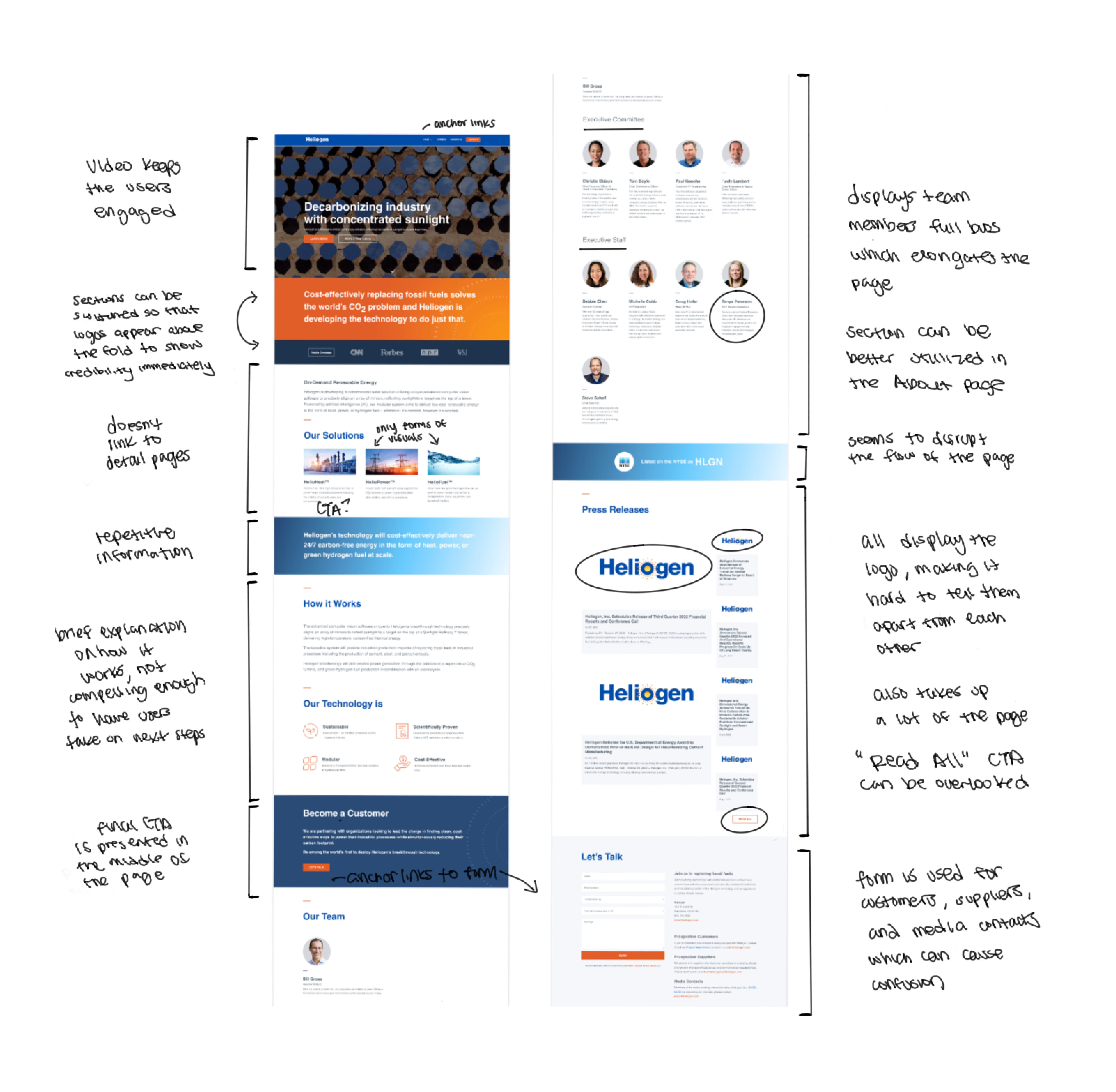
I performed a heuristic evaluation of their homepage in order to comprehend their strengths and weaknesses better. Their homepage contained all the information about their technology and solutions, but they’re unable to create a compelling narrative and help users further educate themselves by providing detail pages.

IA/Sitemap
HEADER
Since the clients were not able to create content for all their pages, we had to combine level 2 and level 3 pages together. I incorporated anchor links in the navigation so users can easily find the content they’re looking for.
FOOTER
The header will remain fixed as the users scroll, while the links in the footer will emphasize pages that are popular and pages they want to drive more traffic to.

Navigation
MEGAMENU
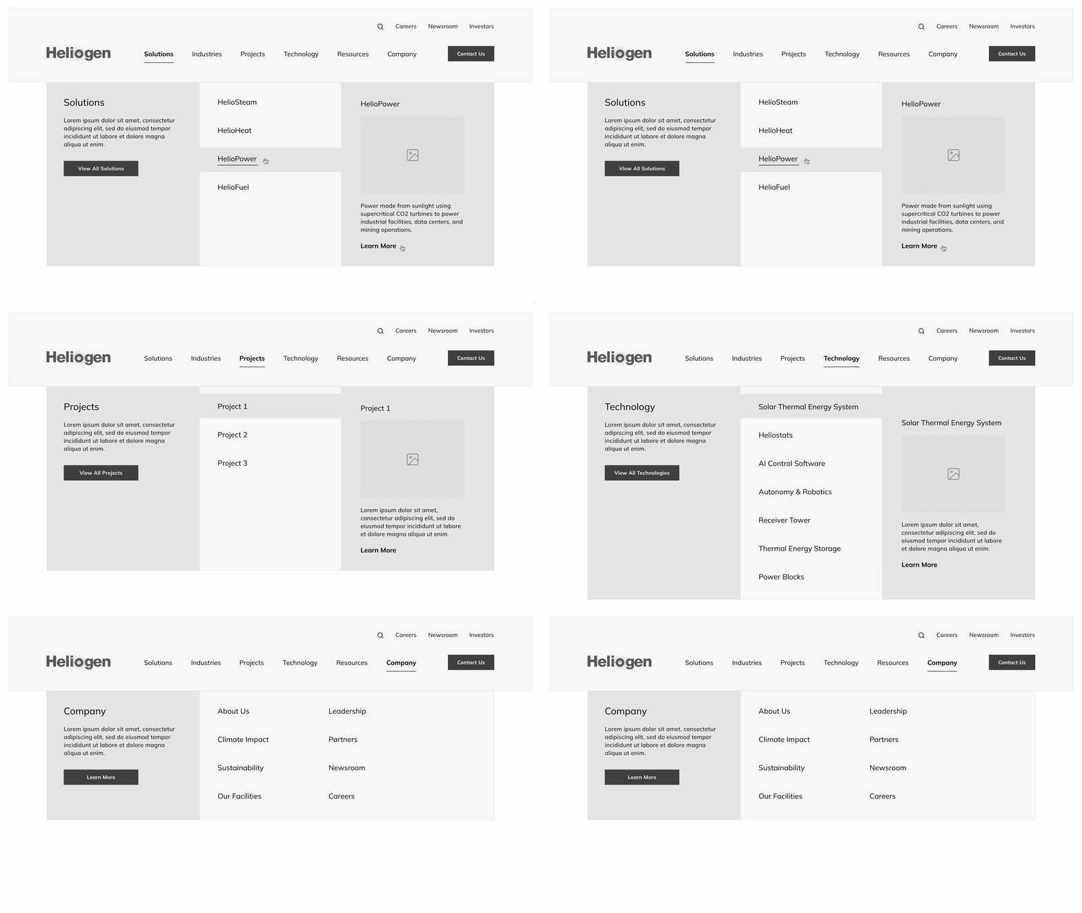
I created a megamenu to make the company appear more established. Since their solutions, projects, and technology would be specific to their company, I provided short descriptions to give users more context about the page before clicking on them.

Wireframes
STRONGER NARRATIVE
I established a more compelling narrative throughout the site to educate users and encourage them to take the next steps.
SECONDARY NAVIGATION
Since we had to combine pages together, this resulted into lengthier pages. To enhance user navigation and ensure easy access to specific sections, I included a sticky secondary menu.
MORE VISUALS
They previously lacked visuals in their site so it was important for them to incorporate more in the redesign to capture the users’ attention and maintain engagement.


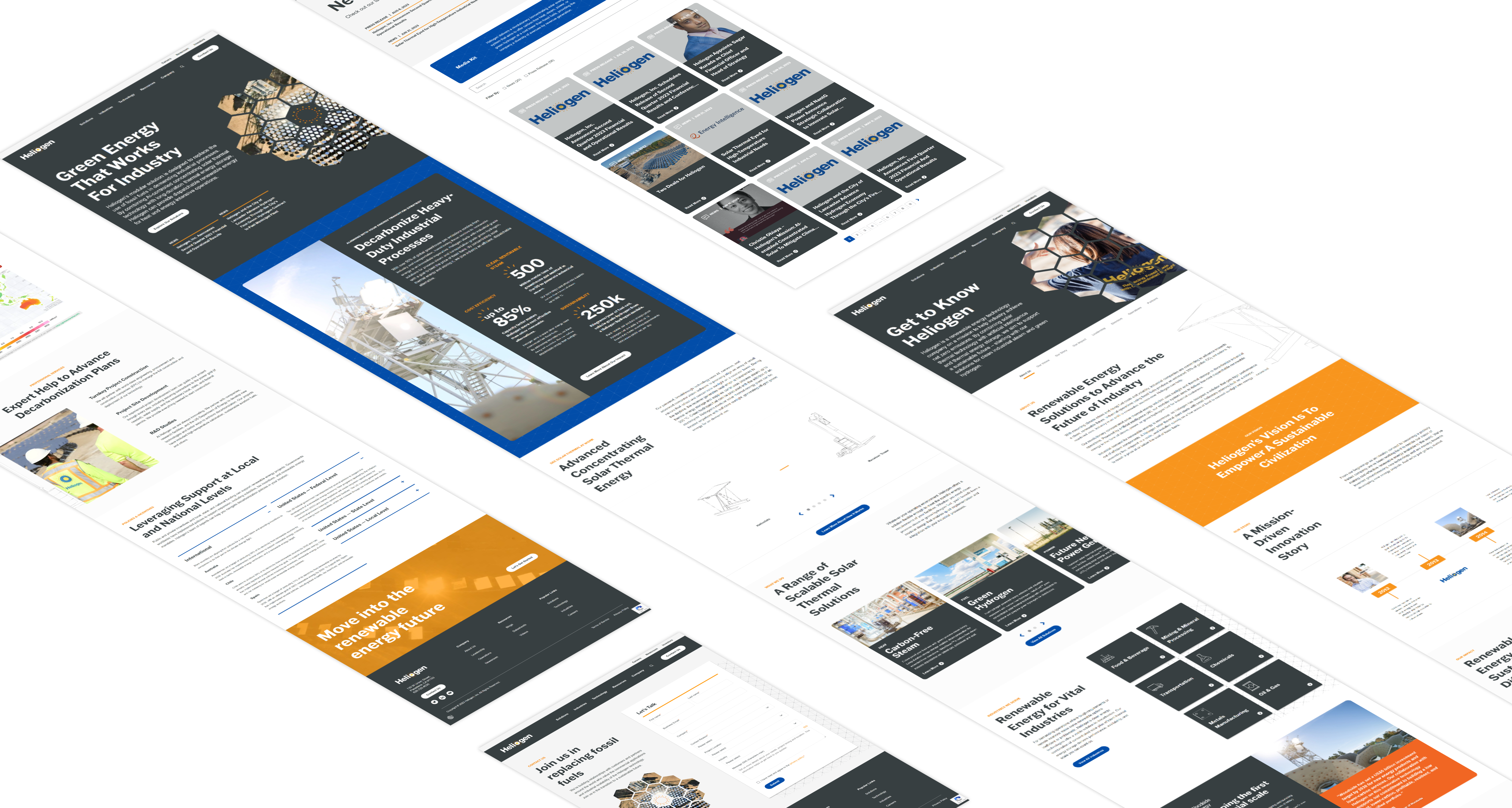
Final Design
After receiving the client’s approval on the wireframes, I would hand them over to the design team. Once the pages were built, I would work with the developer to do QA before launching the site.
